© 2025 Korn Ferry. All rights reserved.
These brand guidelines are a set of tools meant to help colleagues communicate the Korn Ferry brand. The guidelines are for designers, writers, and anyone else using our brand’s elements. In this document, you will learn how different elements of our brand work together to form our identity. This guide will help you develop compelling work that accurately expresses our brand. We have provided working examples; these can inspire you to make new content or be customized to meet your needs. Creating work that adheres to our guidelines is essential to ensuring the look and feel of our communications achieves our goals and reinforces our brand. Please contact Jonathan Pink or Michele Lally with questions or feedback.
These brand guidelines are a set of tools meant to help colleagues communicate the Korn Ferry brand. The guidelines are for designers, writers, and anyone else using our brand’s elements. In this document, you will learn how different elements of our brand work together to form our identity. This guide will help you develop compelling work that accurately expresses our brand. We have provided working examples; these can inspire you to make new content or be customized to meet your needs. Creating work that adheres to our guidelines is essential to ensuring the look and feel of our communications achieves our goals and reinforces our brand. Please contact Jonathan Pink or Michelle Lally with questions or feedback.
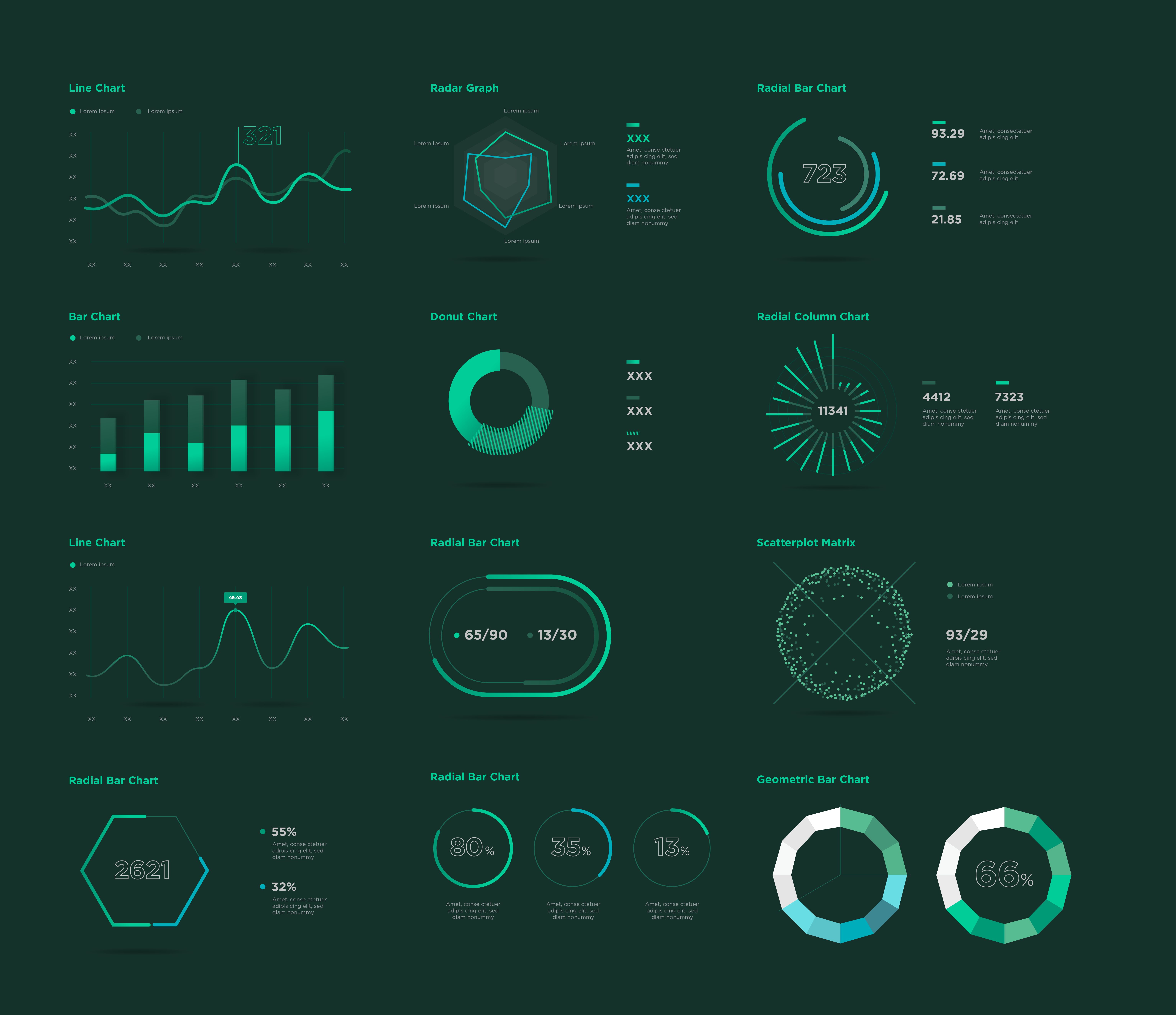
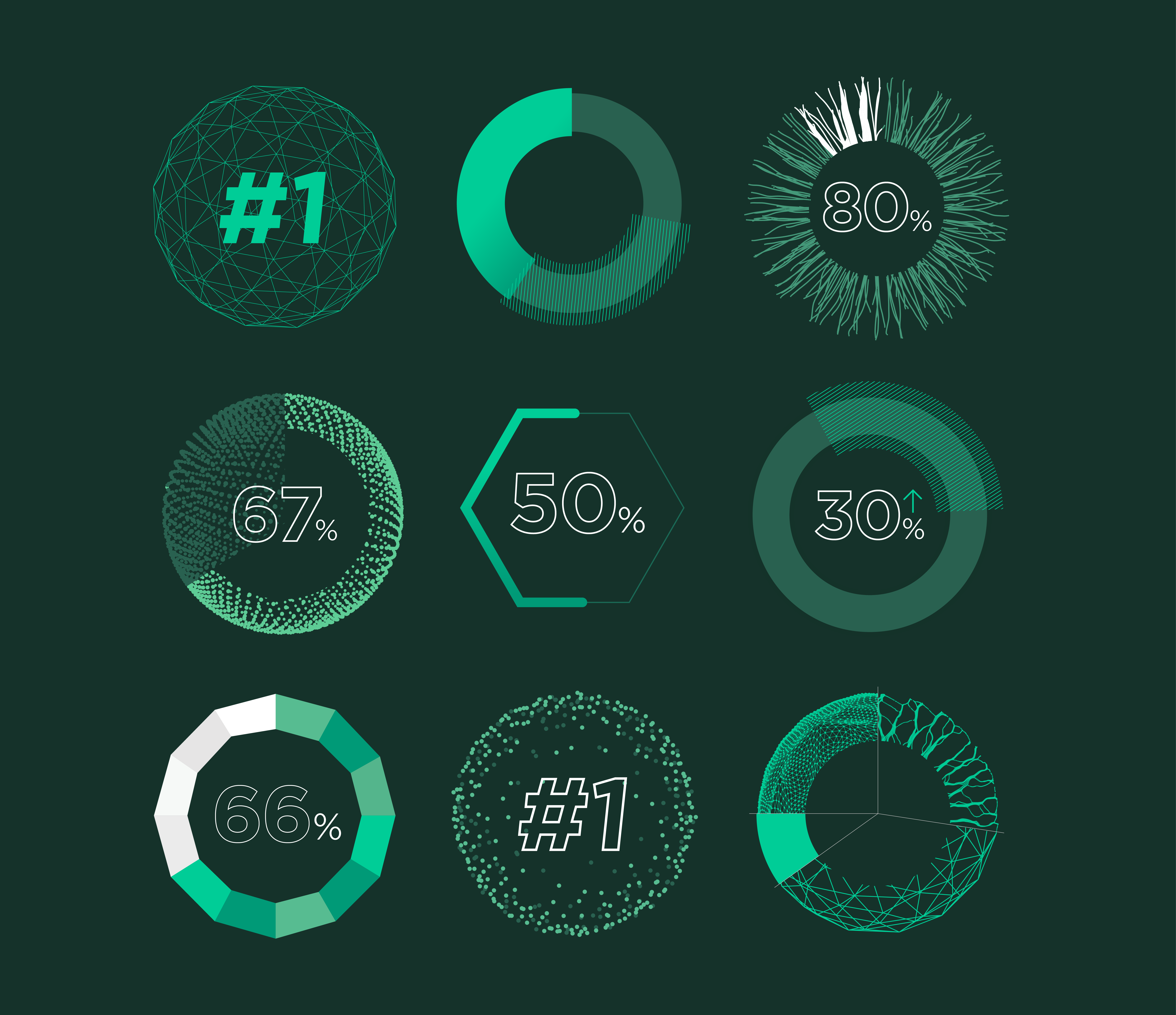
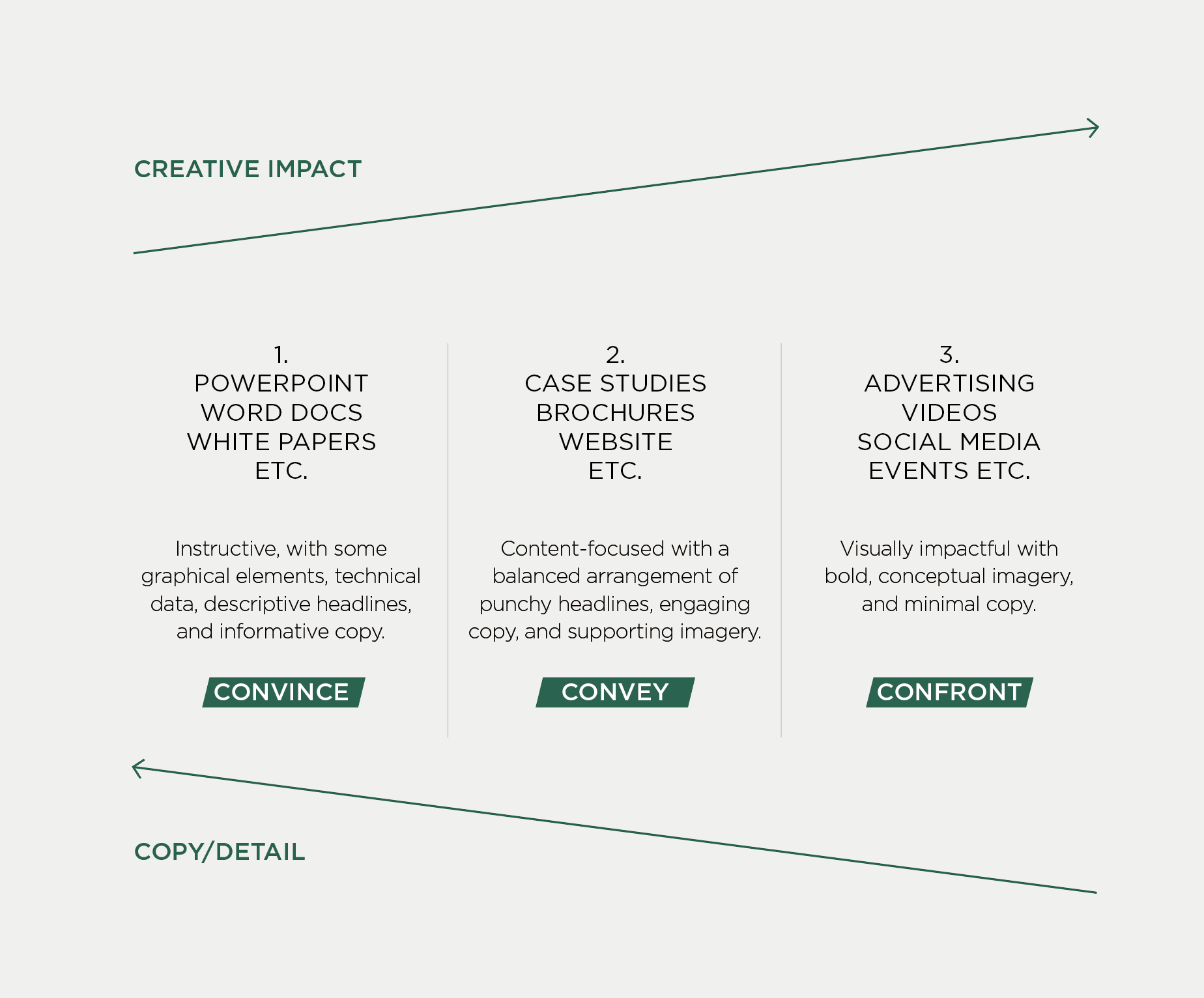
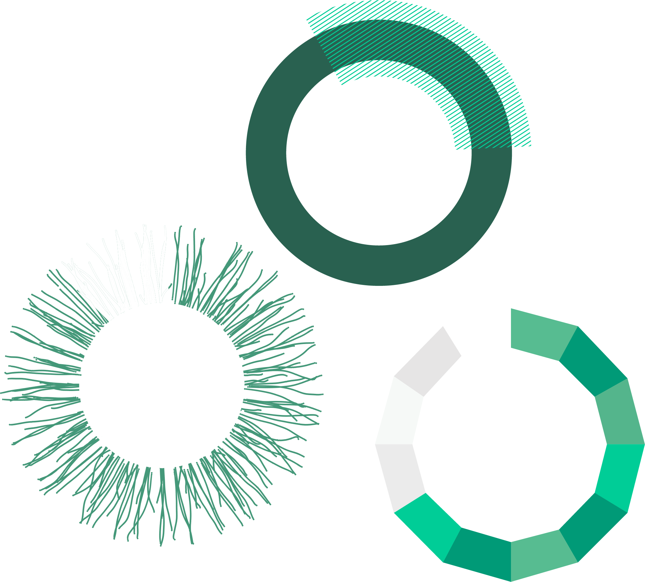
Instructive, with some graphical elements, technical data, descriptive headlines, and informative copy. POWERPOINT, WORD DOCS, WHITE PAPERS, ETC.
CONVINCE
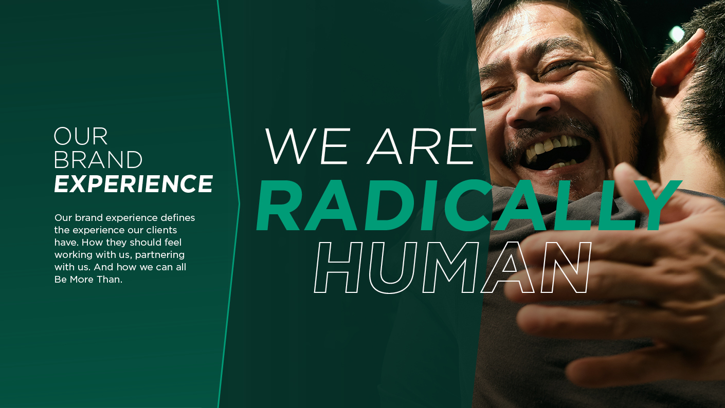
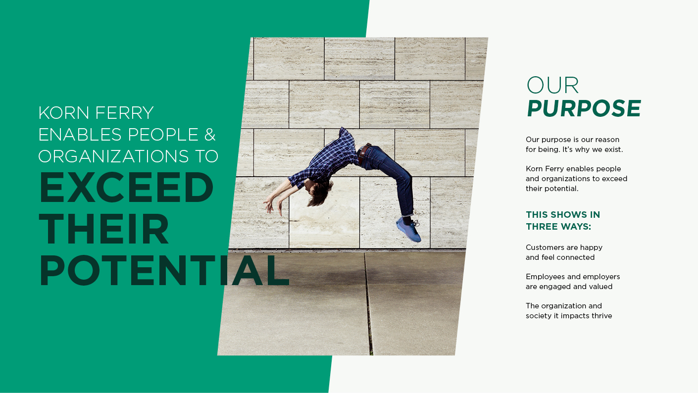
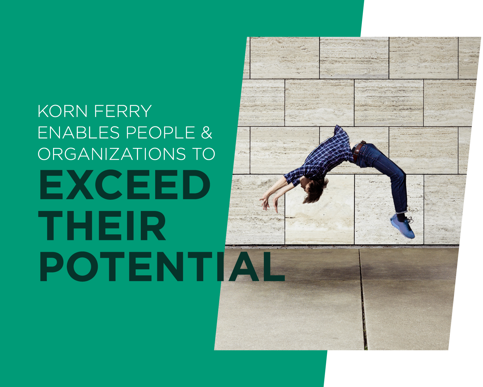
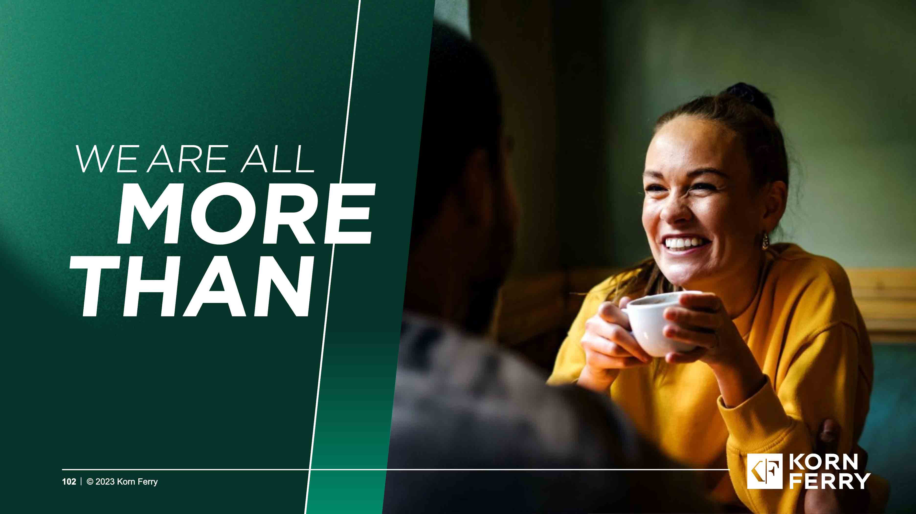
That’s Being More Than.
It’s determination that leads to inspirational progress.
It’s grasping challenging opportunities with both hands, even when they say it can’t be done.
It’s about pushing beyond what you thought was possible.
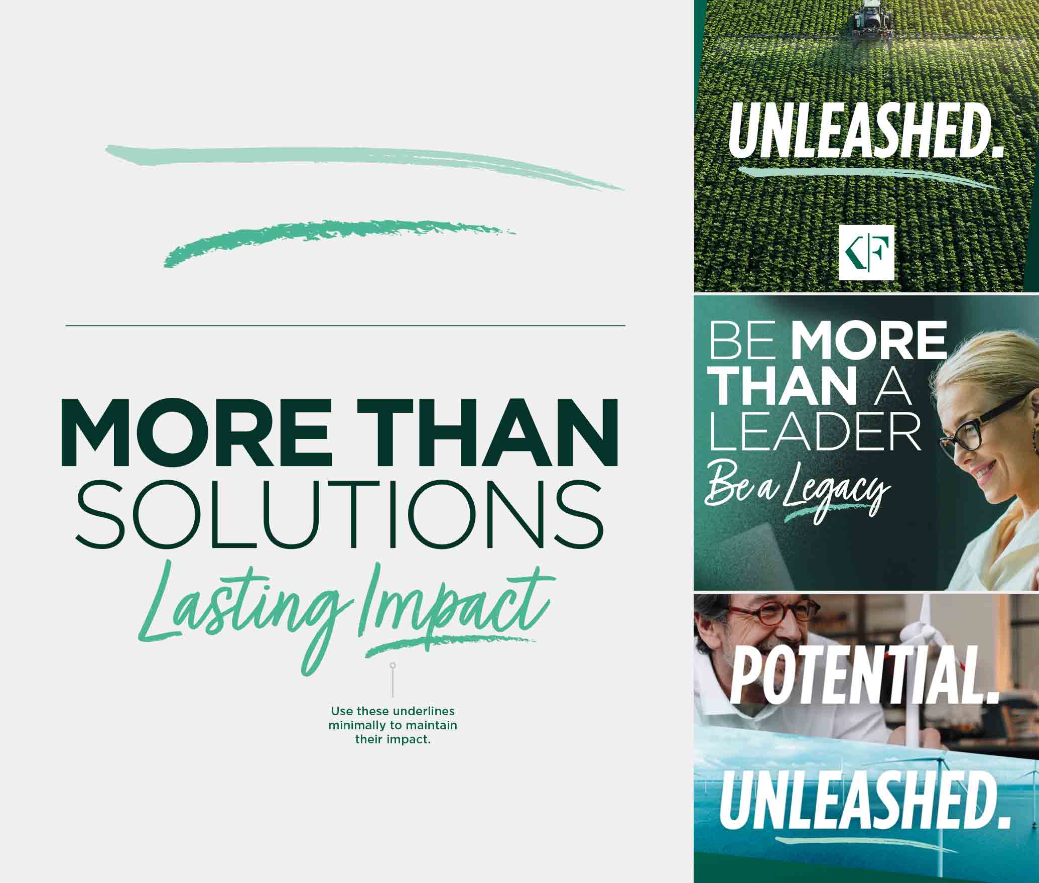
Being More Than is a commitment.
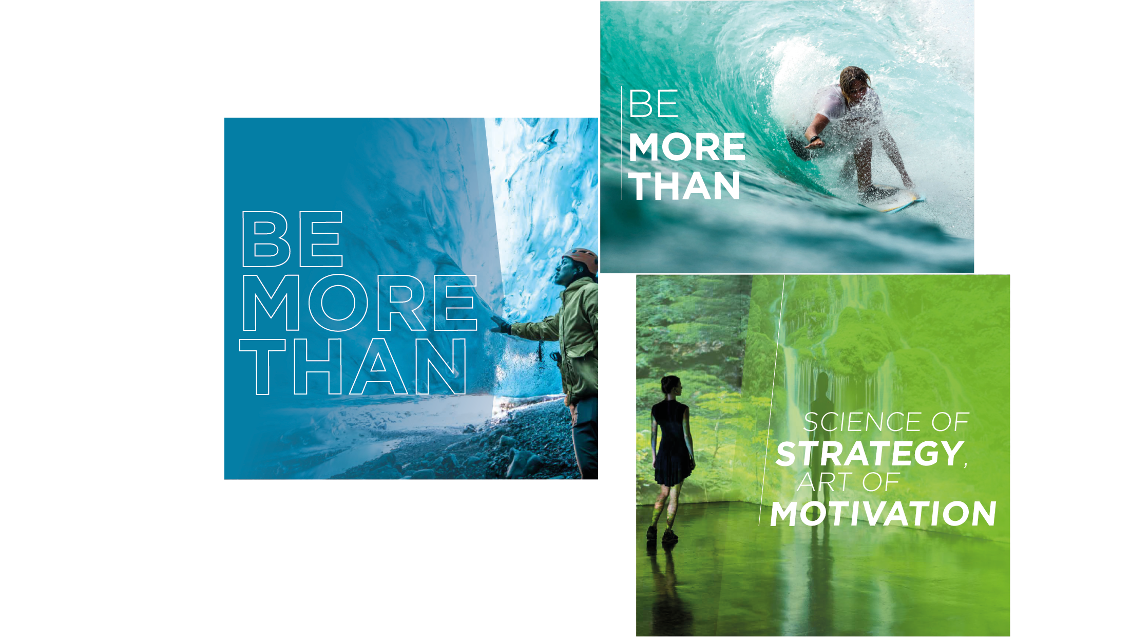
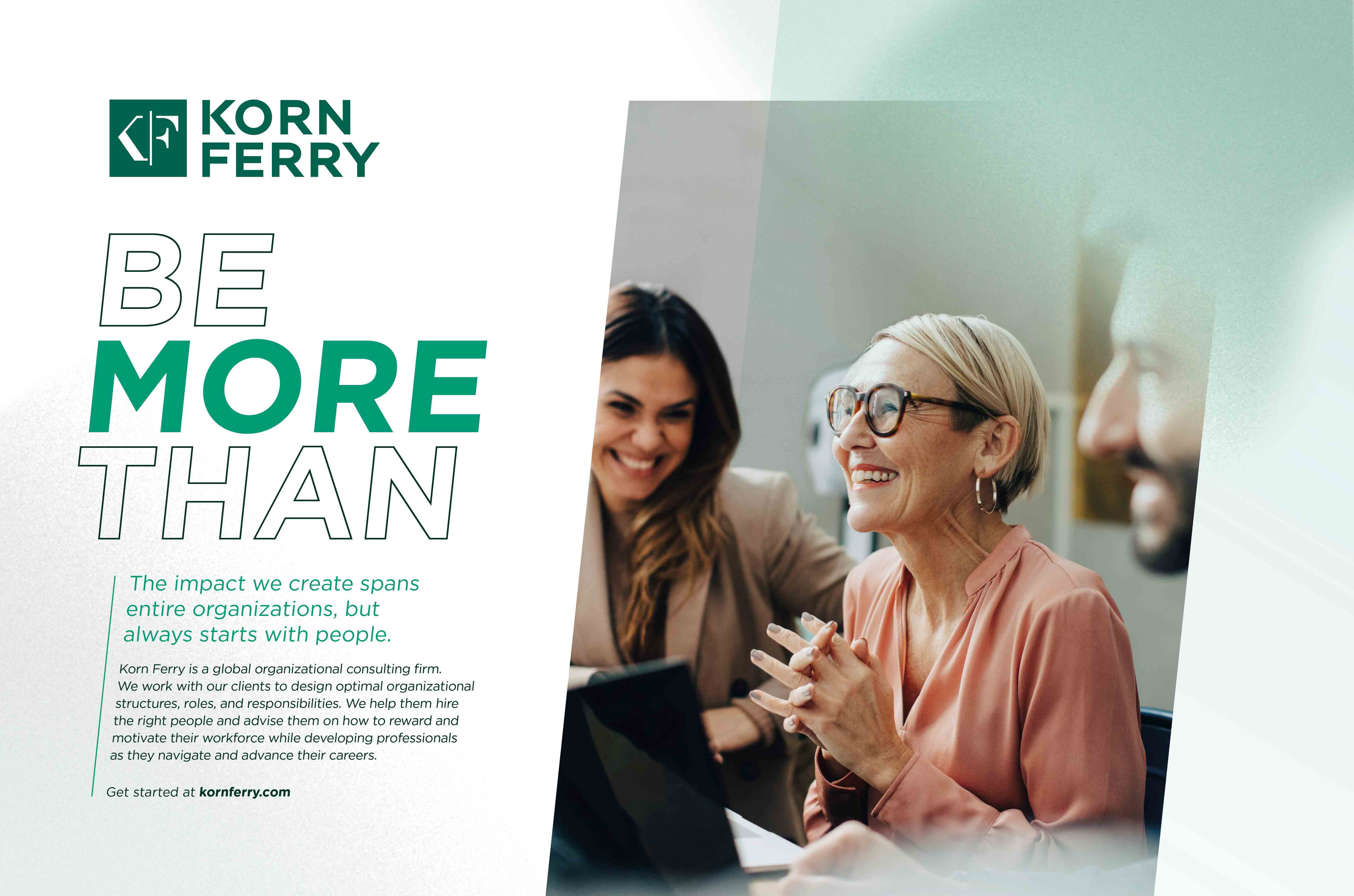
Be More Than
Emotive Our brand promise is our commitment to our employees and clients. Be More Than is the driving force behind everything we do. Empowering leaders, individuals and organizations to exceed their potential and make a lasting impact.
FUNCTIONAL
EMOTIVE
our descriptor
our boilerplate
our promise
Korn Ferry is a global consulting firm that powers performance. We unlock the potential in your people and unleash transformation across your business—synchronizing strategy, operations, and talent to accelerate performance, fuel growth, and inspire a legacy of change. That’s why the world’s most forward-thinking companies across every major industry turn to us—for a shared commitment to lasting impact and the bold ambition to Be More Than.
We must consistently communicate who we are and our commitment to our employees and partners throughout experiences. This can be done in both functional and emotive ways:
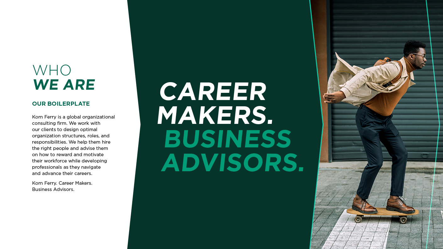
Functional We communicate who we are in two simple statements. Our boilerplate and our descriptor. These are applied consistently in all communications.
Business advisors. Career makers.
Monogram
The logo is comprised of three elements, the monogram, fuse, and the wordmark.
Parent (over-arching) initiatives, sponsorships or ‘brands’ such as Advance, the Korn Ferry Tour, or Briefings Magazine have bespoke logos. New logos can only be created and authorized by the brand team.
Wordmark
Fuse
The primary logo is horizontal and should be used in green or white. The full logo must always be used in advertising and paid media. In these settings, ensure we maximize the position and scale for brand awareness by positioning the logo at the top left or top of the post.
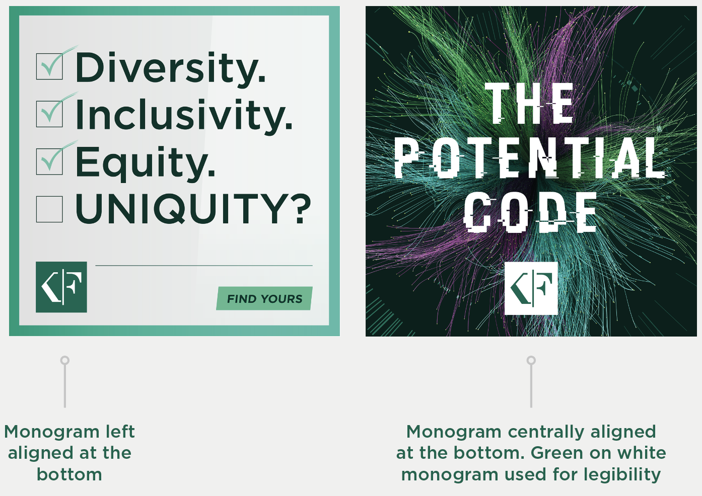
Maintain clear legibility and strong contrast by using either the green-on-white monogram or the white-on-green version. For social media content, only the monogram should be used. Position it in a supportive role at the bottom of the post, either centrally or aligned to the side. Do not use the full logo or place the monogram at the top of the post.
The secondary logo is stacked and should also be used in green or white.
Monogram left aligned at the bottom
Monogram centrally aligned at the bottom. Green on white monogram used for legibility
FOREST GREEN
APPLE
Rollover boxes to see color codes
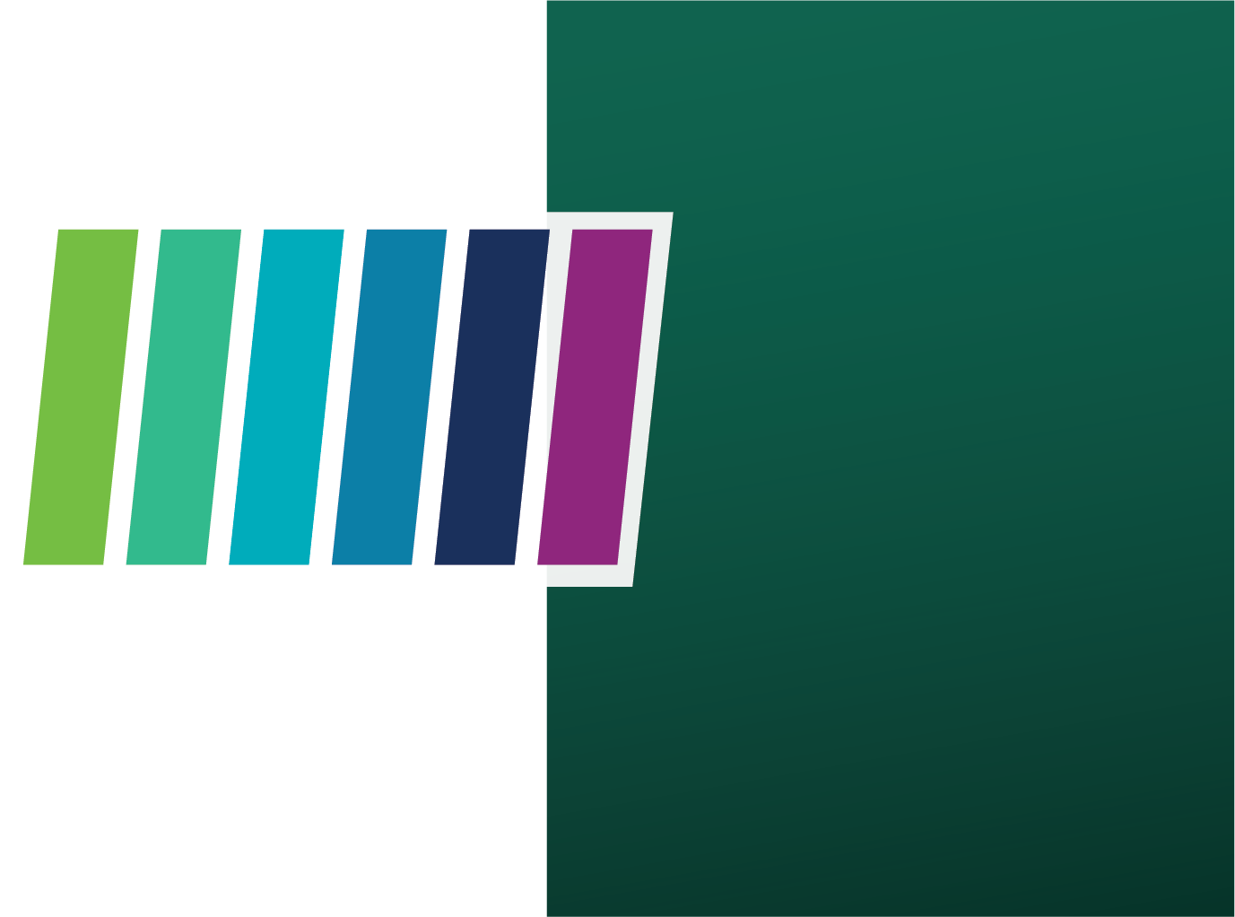
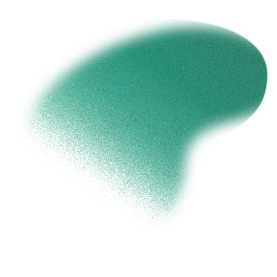
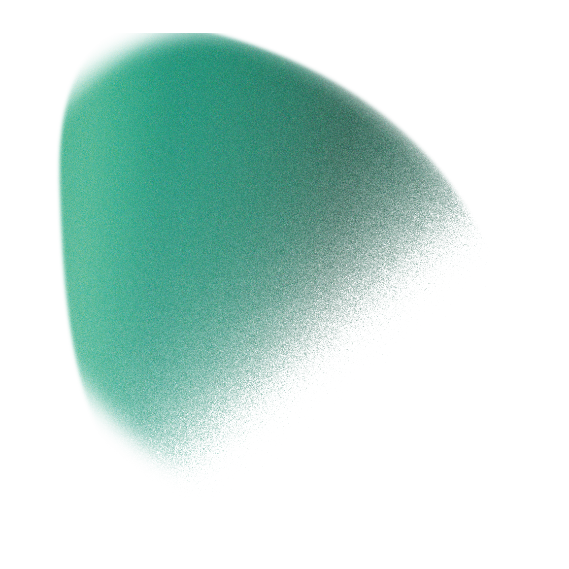
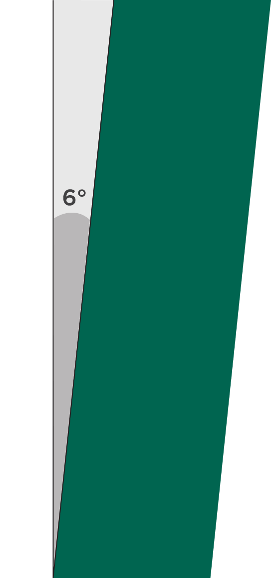
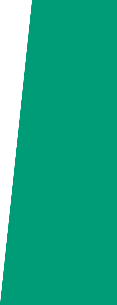
Our primary palette of Dark Forest, Forest Green, and Emerald can be applied using gradients. These add layers and depth to the brand—lifting backgrounds and our 6° device ‘off the page’.
We use these gradients at various scales on Dark Forest and light backgrounds to add texture and depth to the brand.
These can be applied at various opacities to make some areas stronger or lighter with the use of the gradient
Applied to the edges and corners of backgrounds to add texture and depth to our content
58 2 100 30 87 142 49 #568e30
CMYK RGB HEX
58 2 100 0 119 188 31 #77bc1f 368
CMYK RGB HEX PMS
81 12 64 1 0 155 119 #009b77
71 0 60 0 5 198 144 #05c690
95 0 31 25 0 139 150 #008b96
95 0 31 0 0 173 187 #00adbb 7466
100 33 27 40 0 89 113 #005971
100 33 27 2 0 125 164 #007da4 314
100 86 36 60 0 24 59 #00173b
100 86 36 31 0 45 92 #002c5c 648
37 100 2 40 117 0 96 #750060
37 100 2 0 146 10 122 #920a7a 248
0 0 0 0 255 255 255 #ffffff
13 11 12 0 219 217 214 #dad8d6
90 37 73 27 0 101 80 #00634f 336
91 49 72 66 5 51 41 #053328
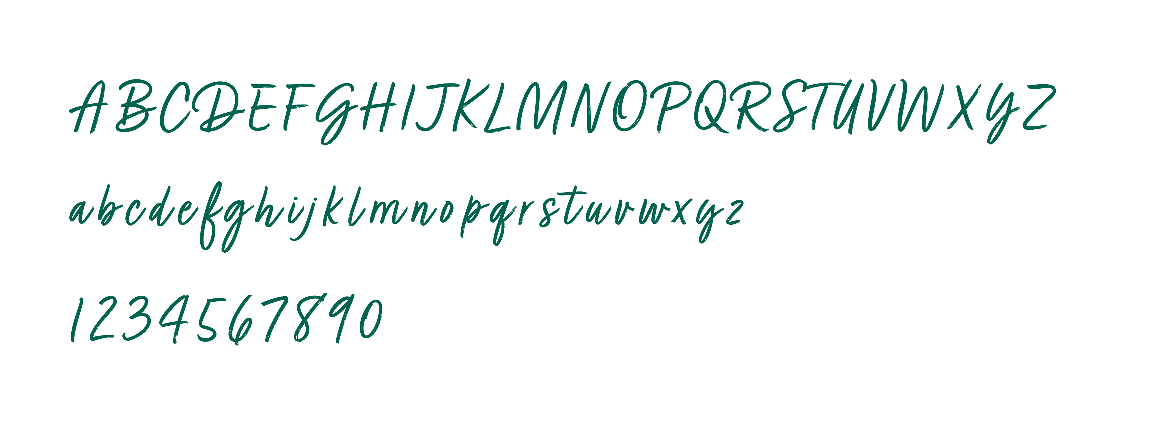
ABCDEFGHIJKLMNOPQRSTUVWXYZ
abcdefghijklmnopqrstuvwxyz
1234567890
Gotham Thin
Gotham Light
Gotham Book
Gotham Medium
Gotham Bold
Gotham Black
Gotham Thin italic
Gotham Light italic
Gotham Book italic
Gotham Medium italic
Gotham Bold italic
Gotham Black italic
Arial bold italic
Arial Italic
Arial Bold
Arial Regular
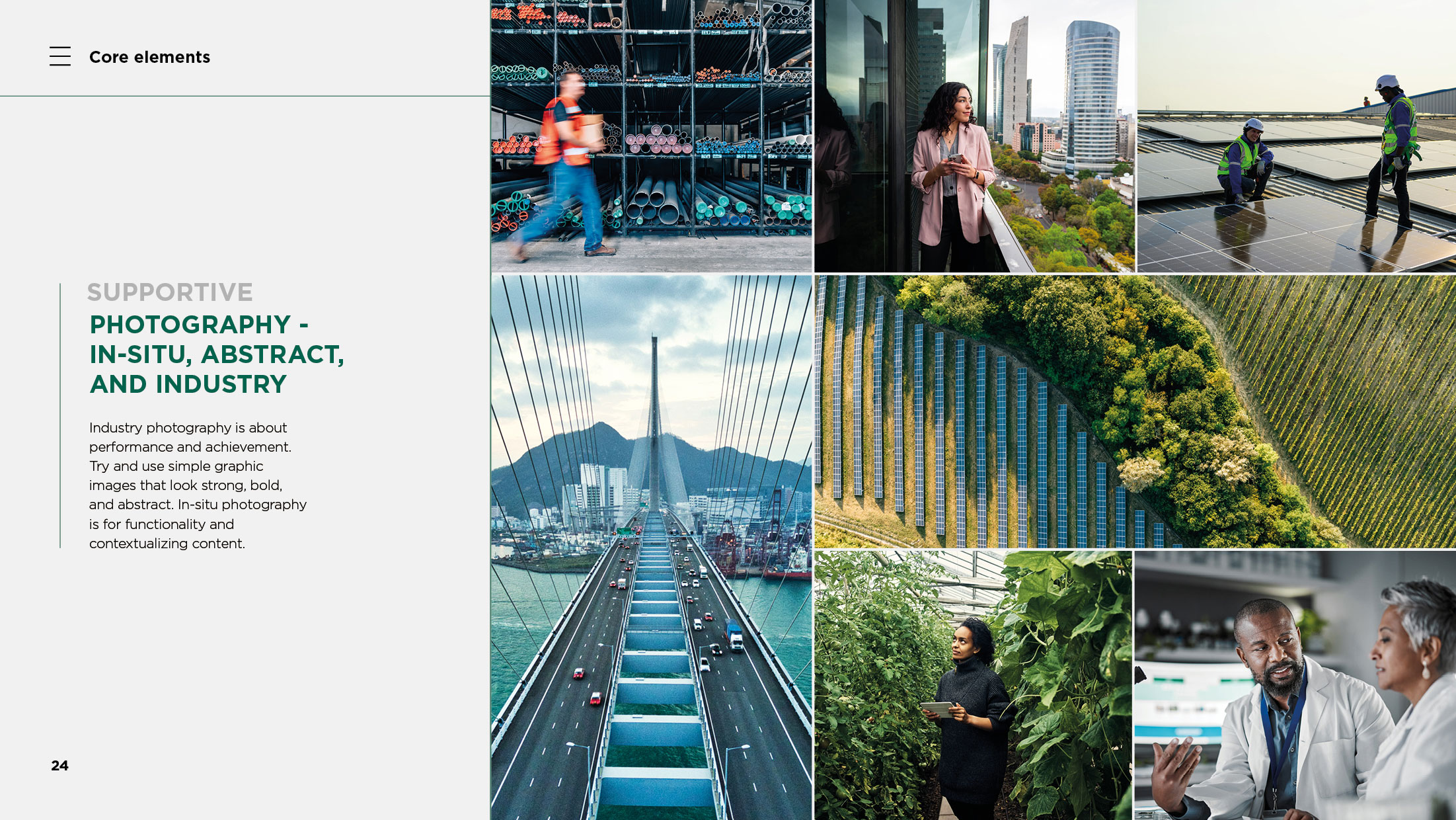
Industry photography is about performance and achievement. Try and use simple graphic images that look strong, bold, and abstract. In-situ photography is for functionality and contextualizing content.
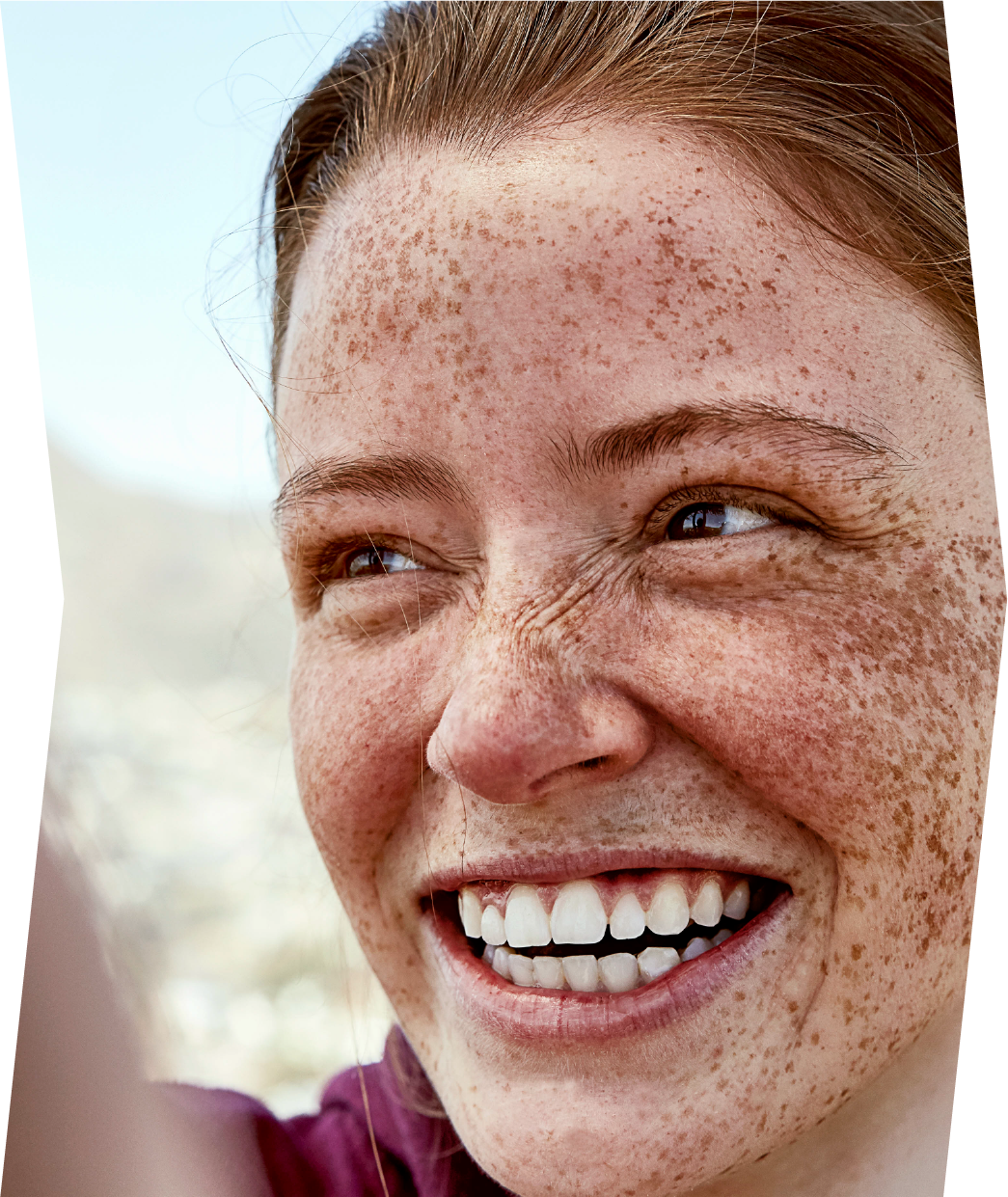
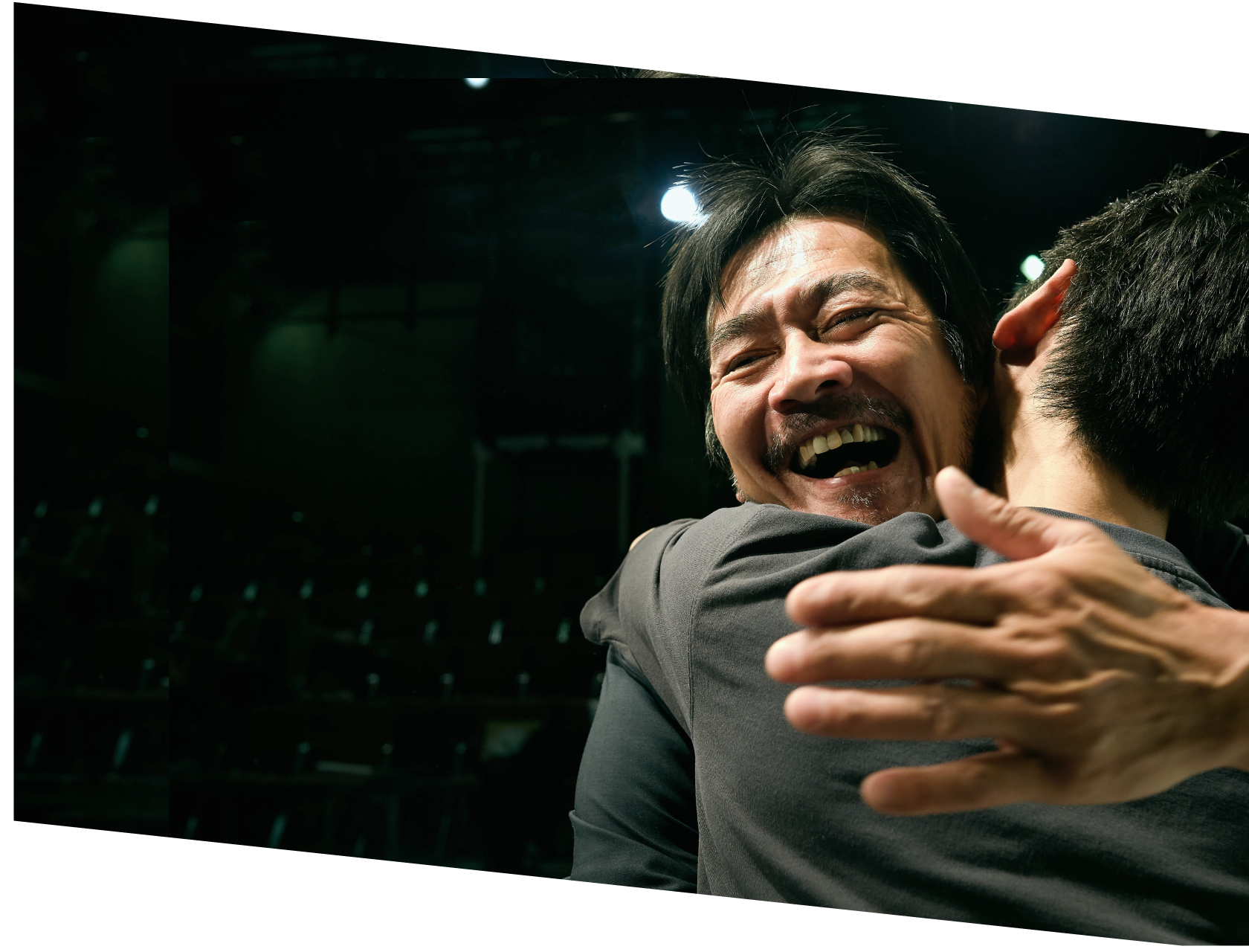
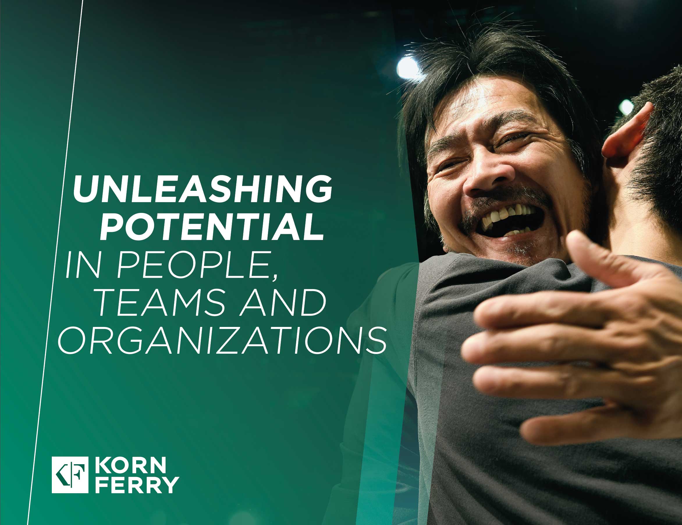
We capture the world of work today. All our business photos tell a story, are human, and positive in tone. They reassure our audience, by contextualizing to the familiar.
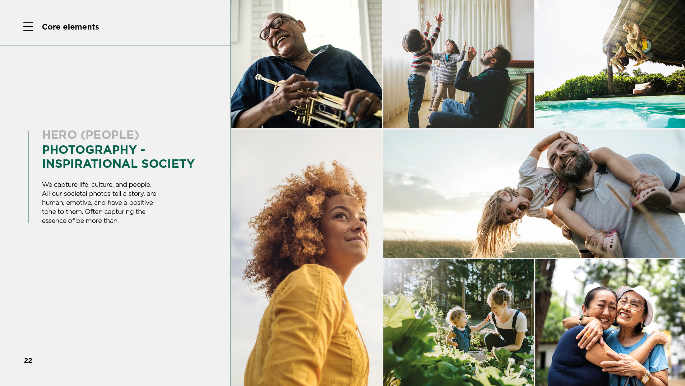
We capture life, culture, and people. All our societal photos tell a story, are human, emotive, and have a positive tone to them. Often capturing the essence of be more than.
6 degree arrowhead
6 degree shapes
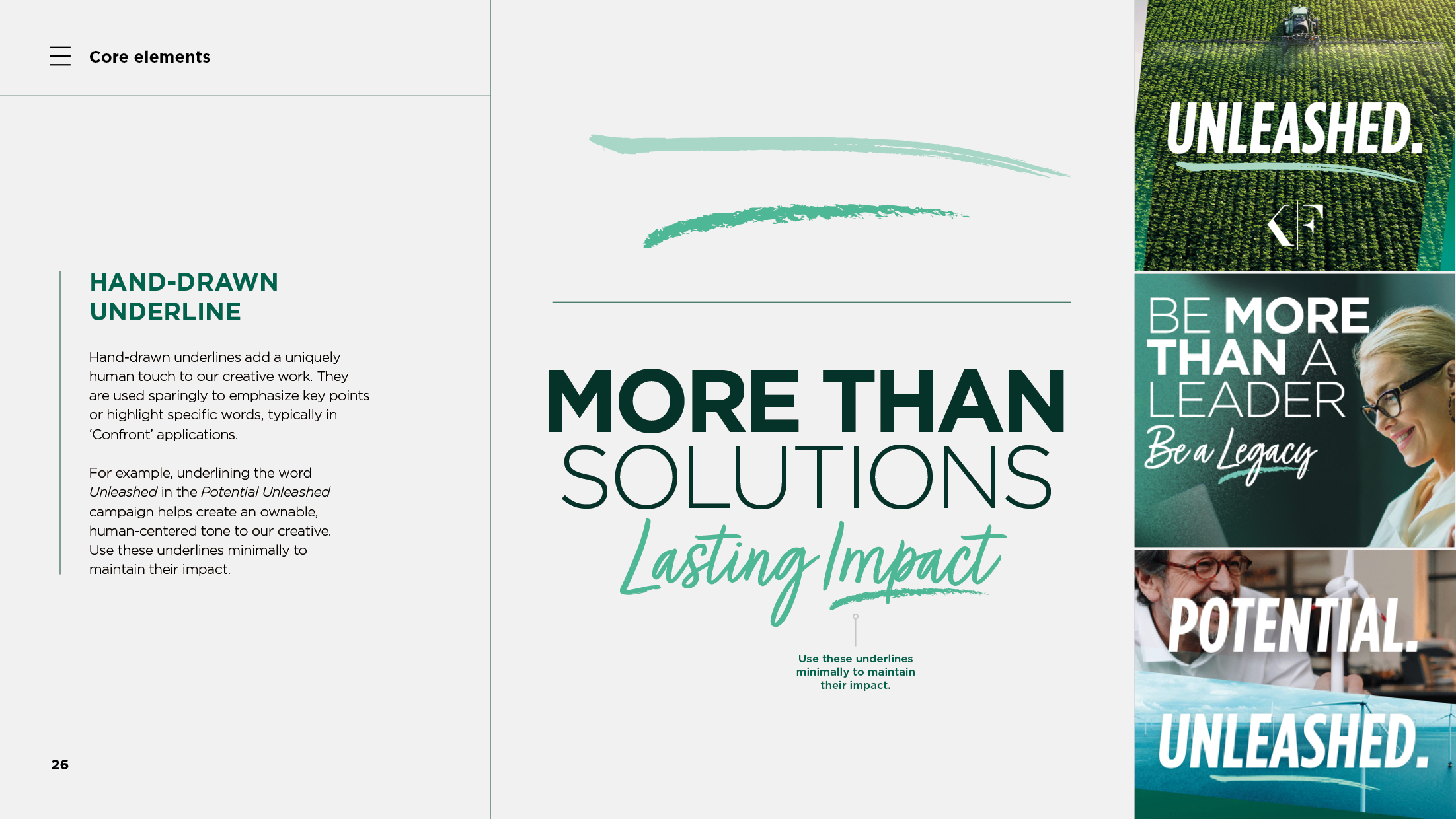
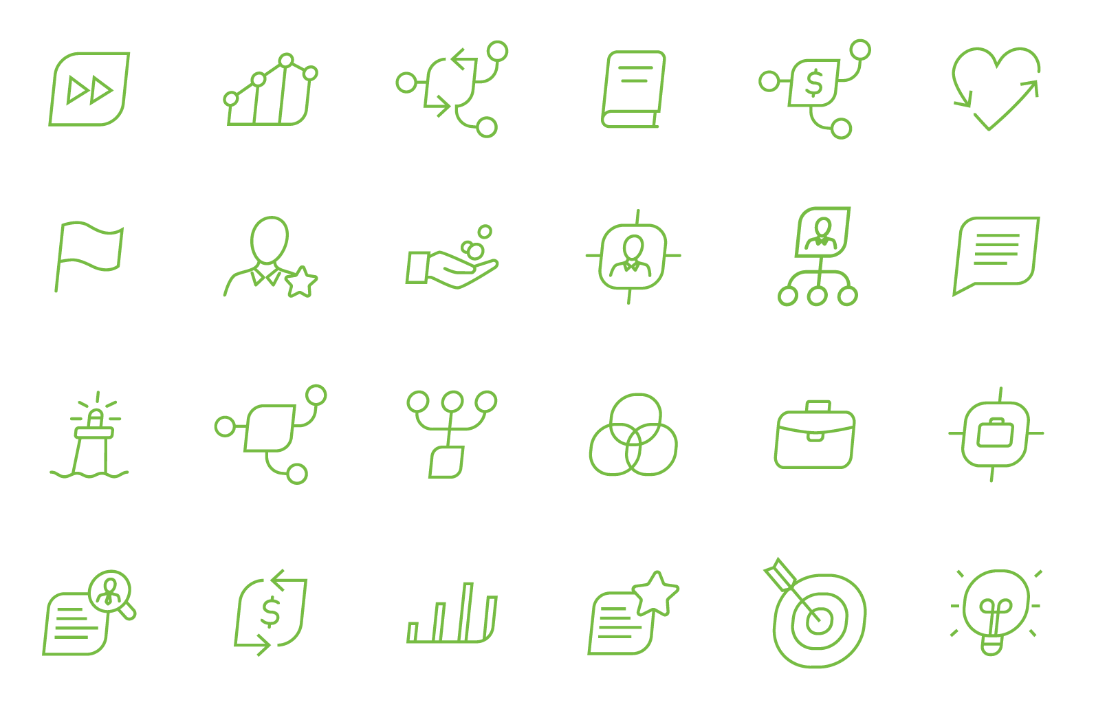
These abstract icons are simple and, by being drawn with a line weight of 1pts, mirror the delicate nature of our logo. When scaling icons up, be sure to increase the line weight proportionately. Supplementary icons which align to our styling can be found here:
fontawesome.com
thenounproject.com
Icons can be outlined in Apple green or 80% gray. They can also appear in white on our solid Forest Green. The icons can occasionally appear in secondary colors, but only when the preferred options are not practical. Examples of our brand icons can be seen to the side.
CONVEY
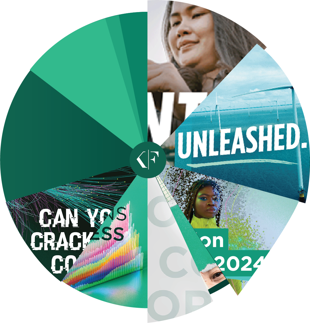
CONFRONT
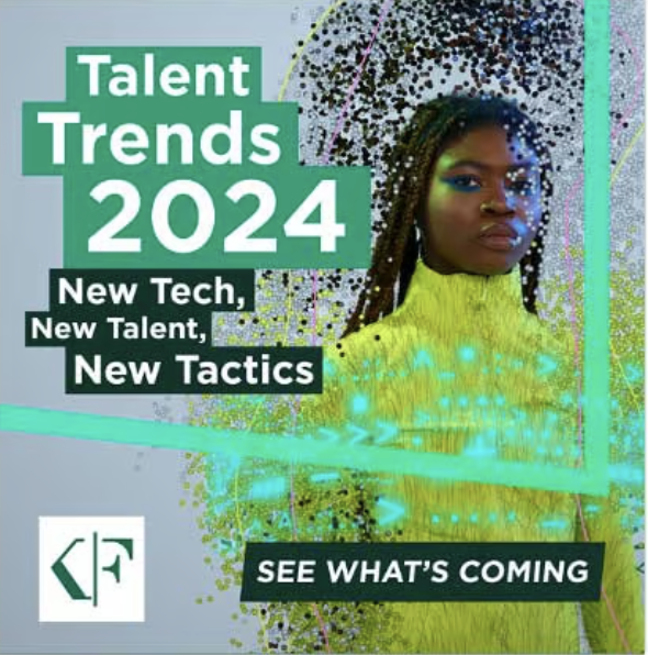
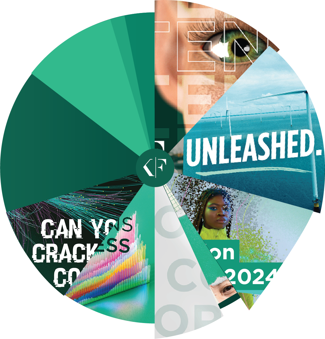
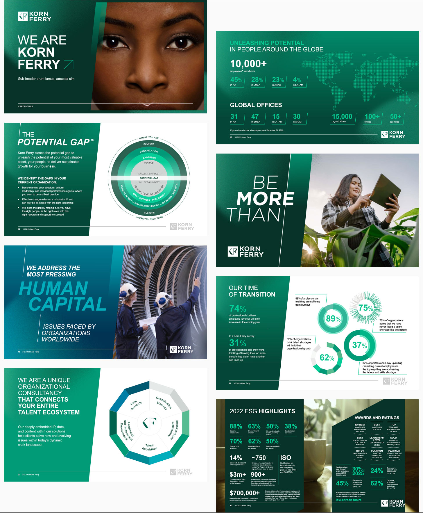
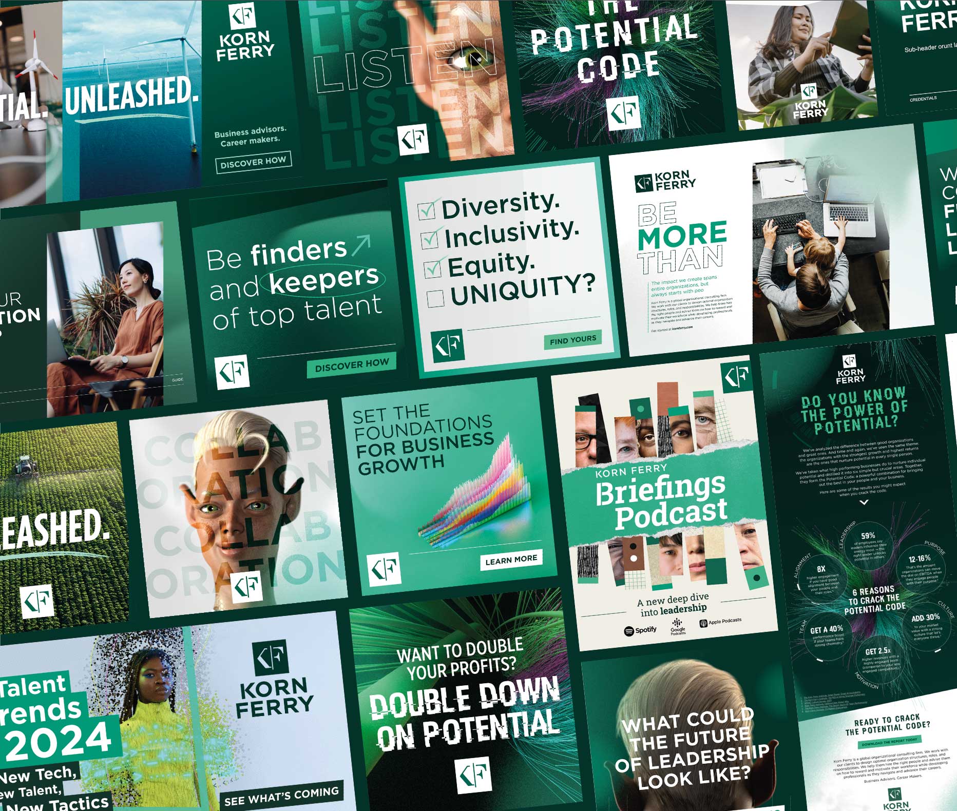
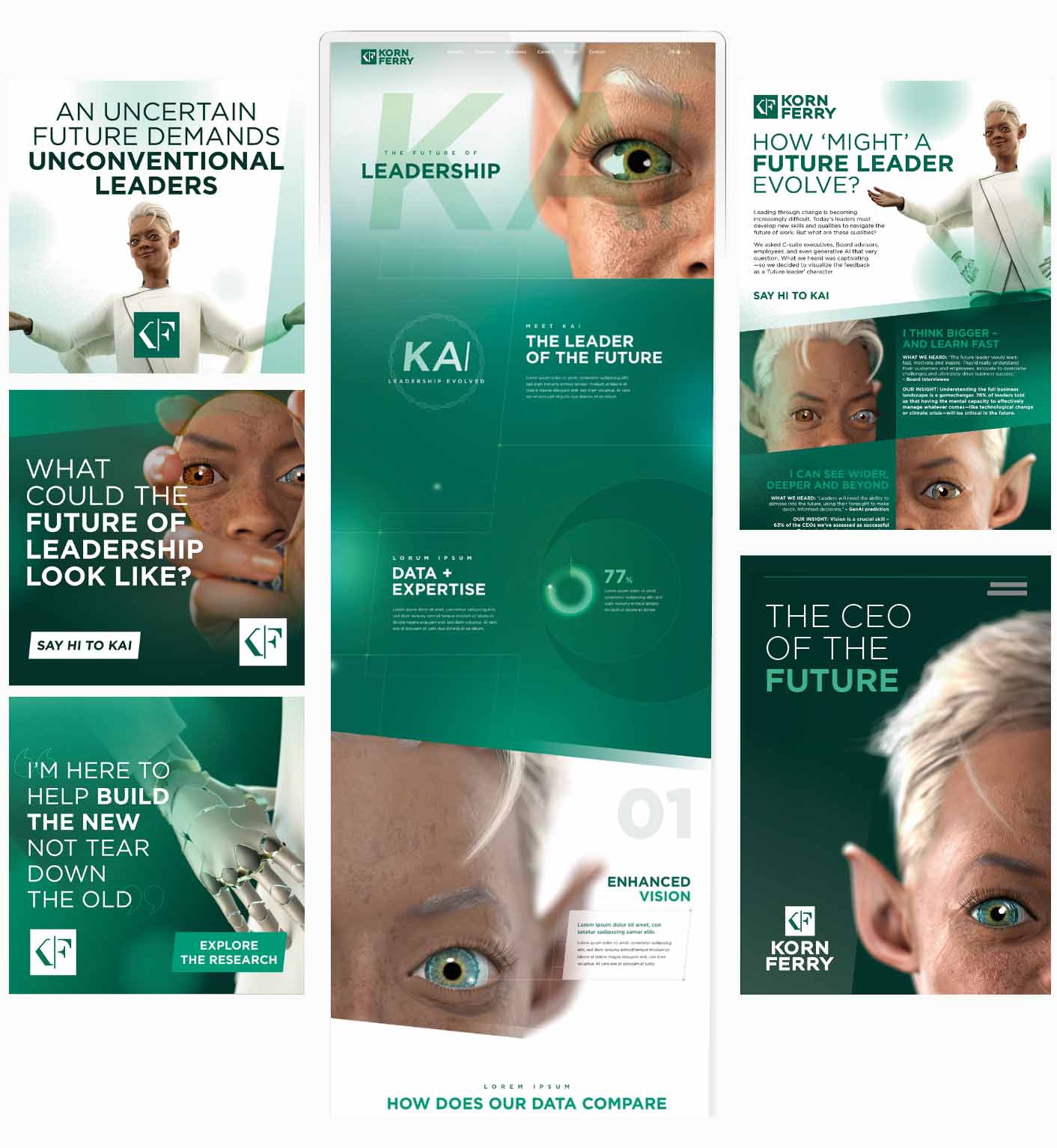
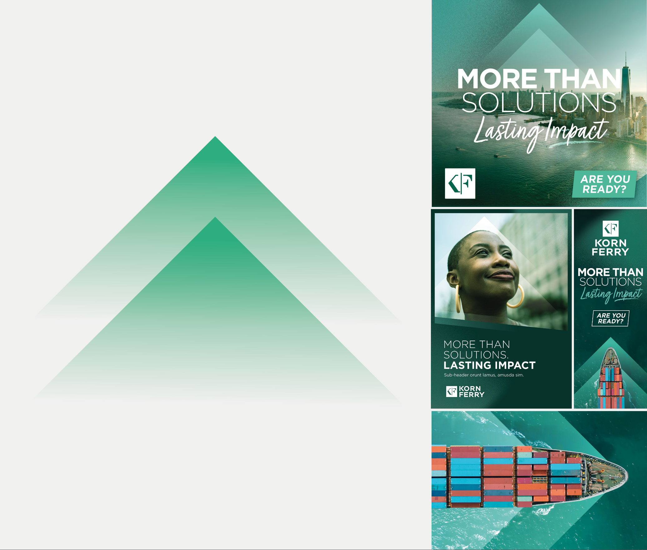
In efforts to simplify and amplify our brand, we’re constantly communicating an ‘ever-green’ approach. This utilizes our core brand elements reinforces our objectives of greater brand awareness. We engage our audience through a series of themes, “Lead Through Change”, Transform for Growth”, and “Find and Keep Top Talent”—aligning to the biggest challenges and questions organizations face. These each engage our audience with a multi-channel hero piece experience which raises awareness and drives traffic to solution and expertise content. We flex our brand beyond “evergreen” and express itself with greater individuality, whilst aligning to our core elements.
Here we have an example of one of our hero pieces, ‘The Future of Leadership’ that sits under our ‘Lead Through Change’ theme. This hero content engages our audience with a multi-channel hero piece experience which raises awareness and drives traffic to solution and expertise content. We flex our brand beyond “evergreen” and express itself with greater individuality, whilst aligning to our core elements.
Of course, brands need to have a consistent look and feel and tone of voice. And while our “Confront” hero content comply with these guidelines, they add a layer of creativity. Each hero style should have a point of differentiation— because if they’re all too similar, there’s a danger our audience will become overexposed to our brand and think they’ve seen it all before. This can be in the form of photography, illustration, a supporting font, the secondary color palette, or graphic elements. Collateral includes ads, social media, events, ect.
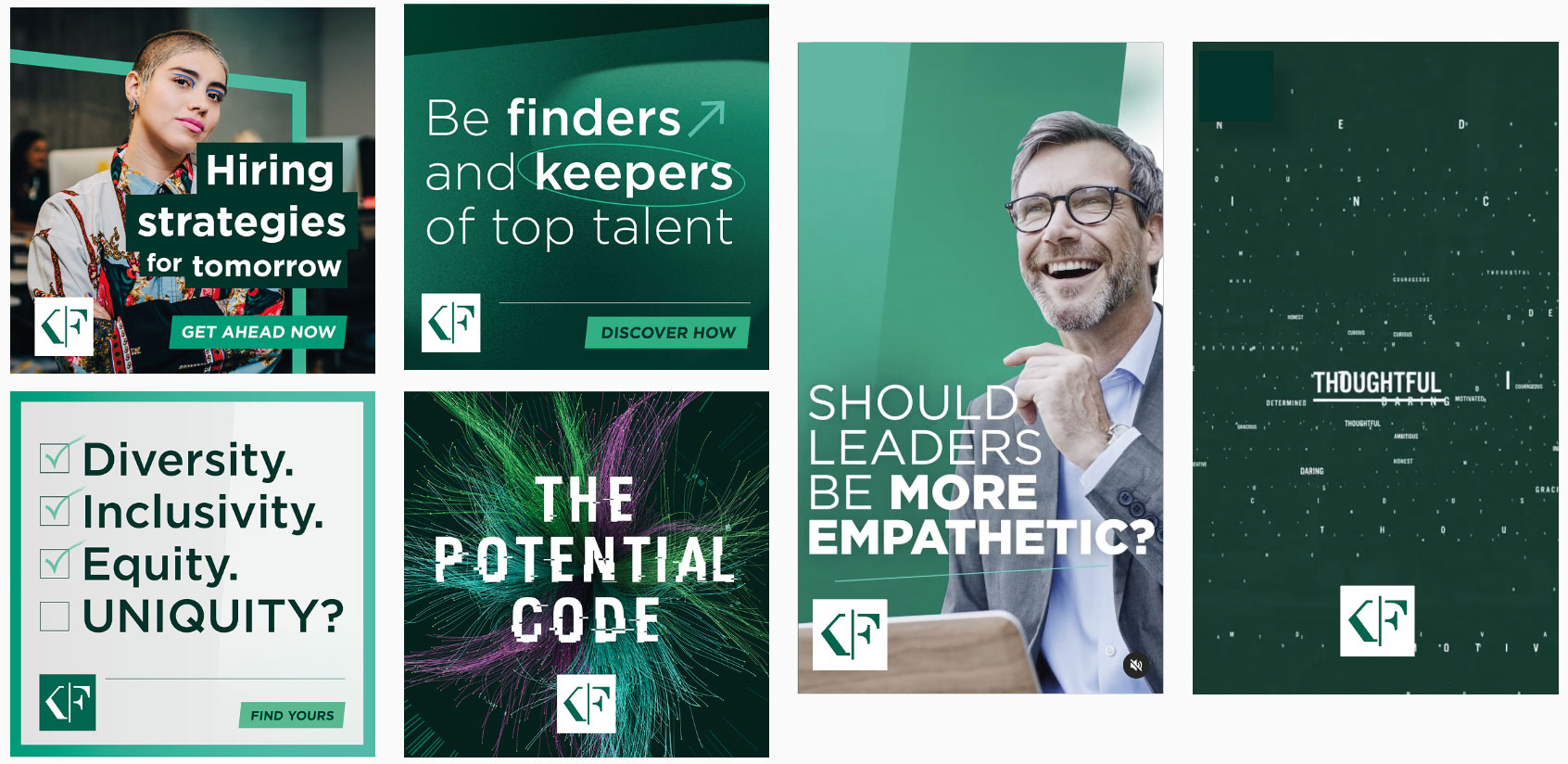
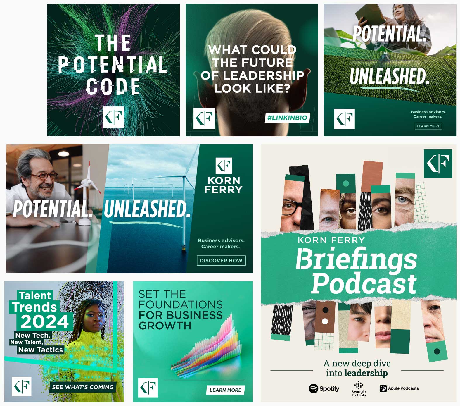
Social platforms are used to communicate both brand ‘Convey’ and hero ‘Confront’ content. Each post or carousel is always looking to have impact and stand-out, cutting through the everyday and engaging with our audience. For social media content, only the monogram should be used. Position it in a supportive role at the bottom of the post, either centrally or aligned to the side. Do not use the full logo or place the monogram at the top of the post. Maintain clear legibility and strong contrast by using either the green-on-white monogram or the white-on-green version. Always use the provided logo assets without alterations.
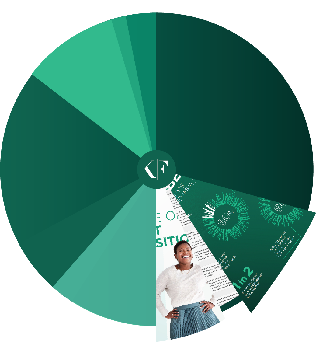
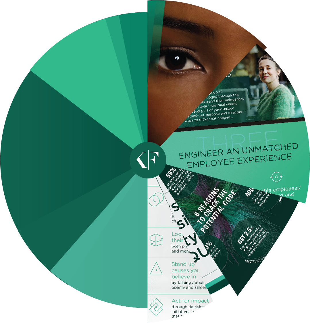
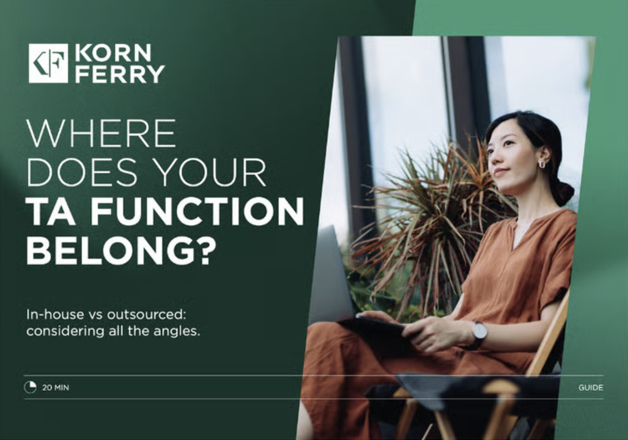
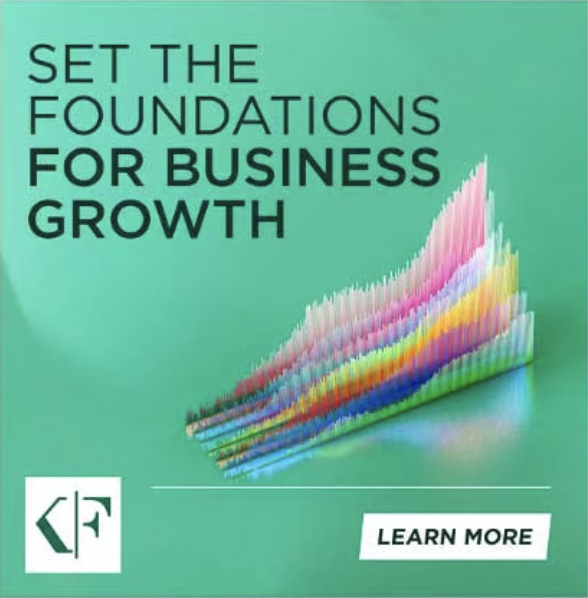
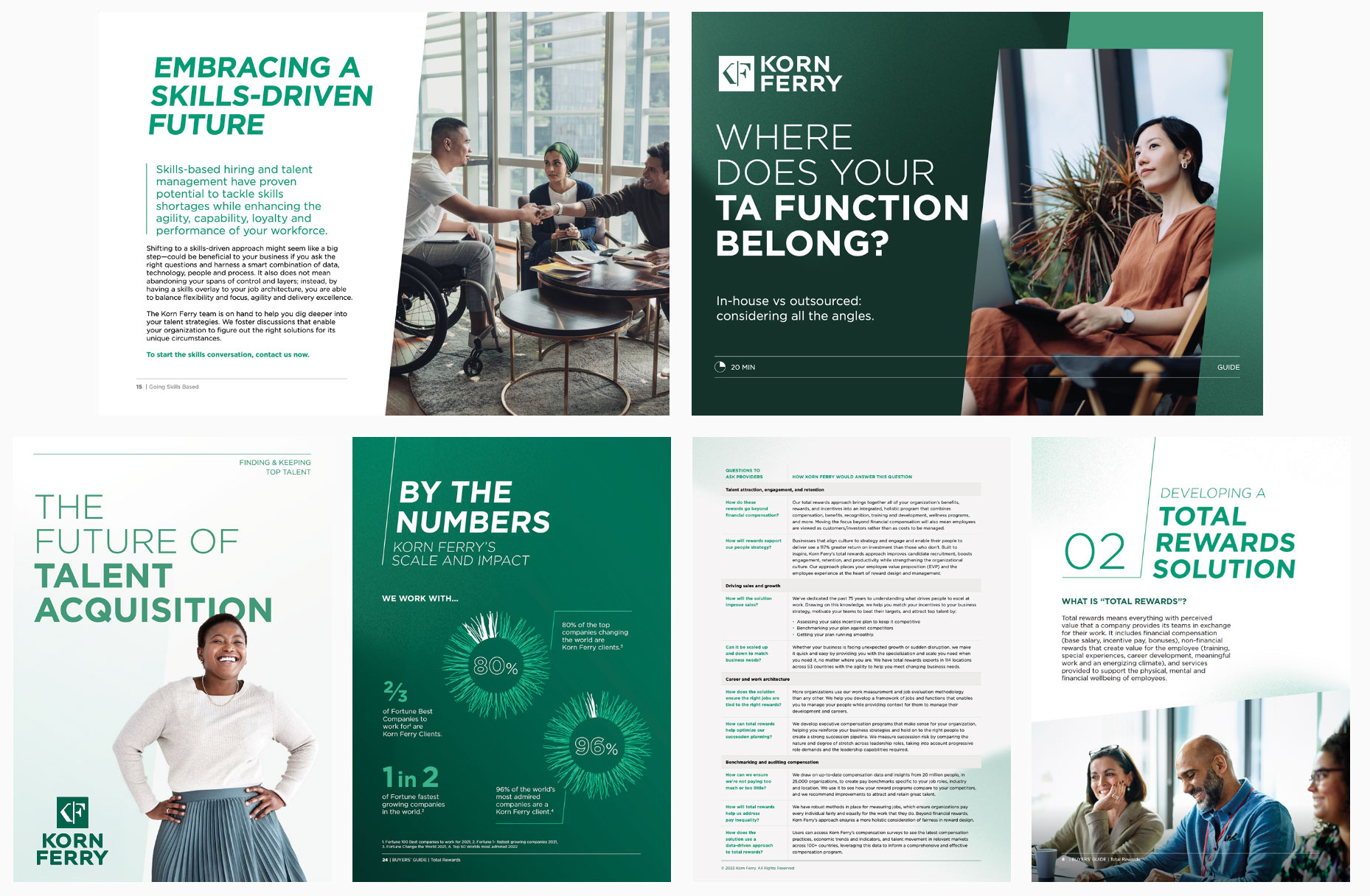
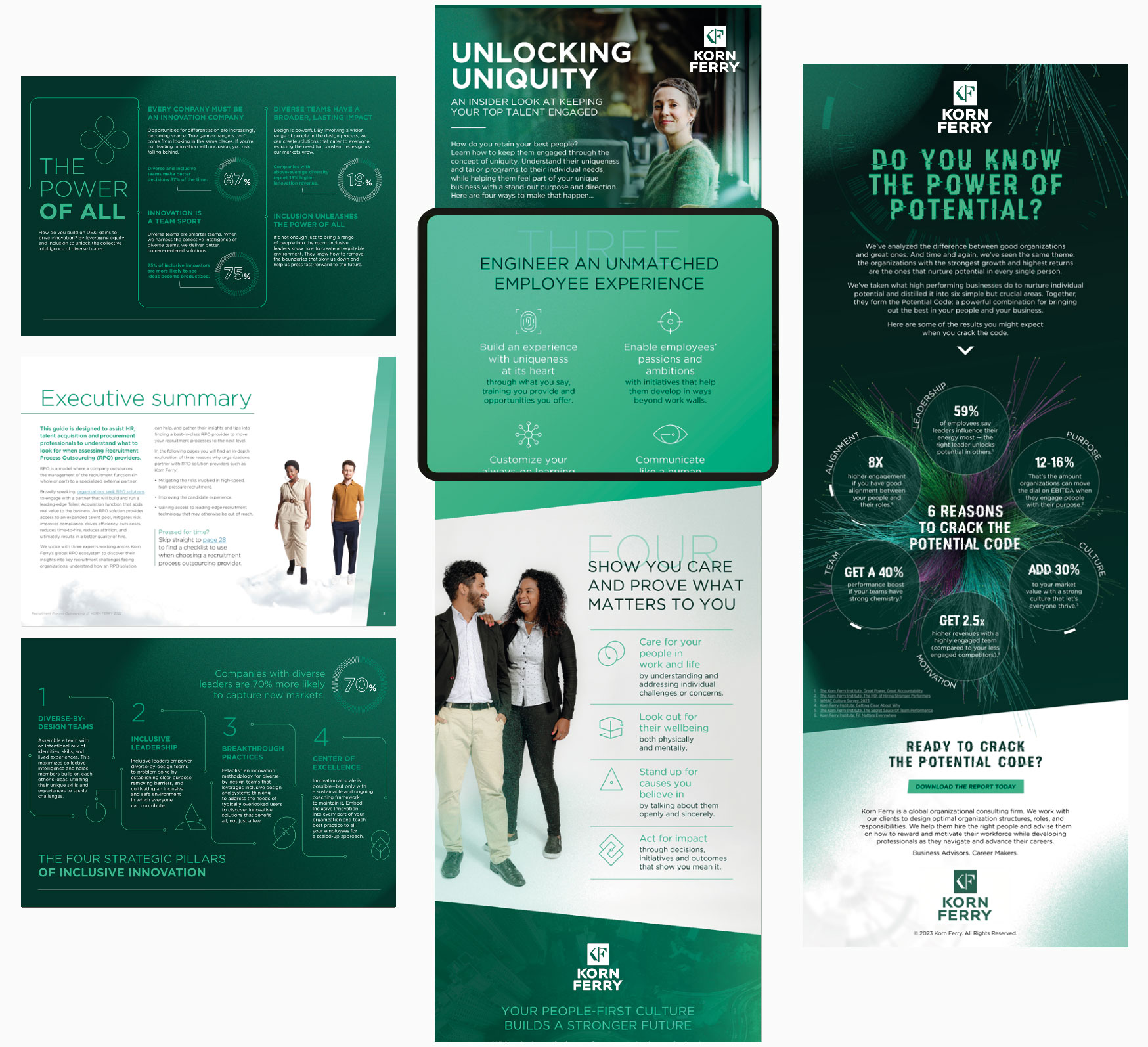
This section looks at collateral which conveys the brand to audiences who still need convincing. These pieces will be content-focused with a balanced arrangement of punchy headlines, engaging copy, and supporting imagery. Collateral includes case studies, ebooks, brochures, surveys, etc.
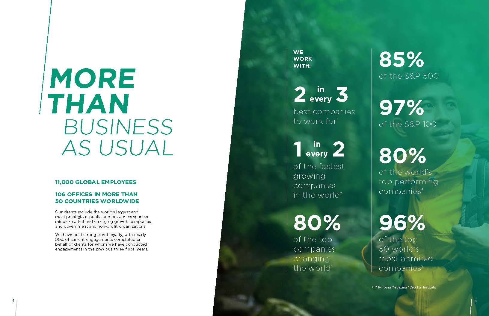
Convince assets are instructive and informative. They are developed to convince our audience that Korn Ferry has the right solution for them. Convince assets include graphical elements and imagery, technical data, and descriptive headlines. Formats include PowerPoint, Word, whitepapers, etc.
Convince assets are instructive and informative. They are developed to convince our audience that Korn Ferry has the right solution for them. Convince assets include graphical elements and imagery, technical data, and descriptive headlines. Formats include PowerPoint, Word, whitepapers, ebooks, etc.
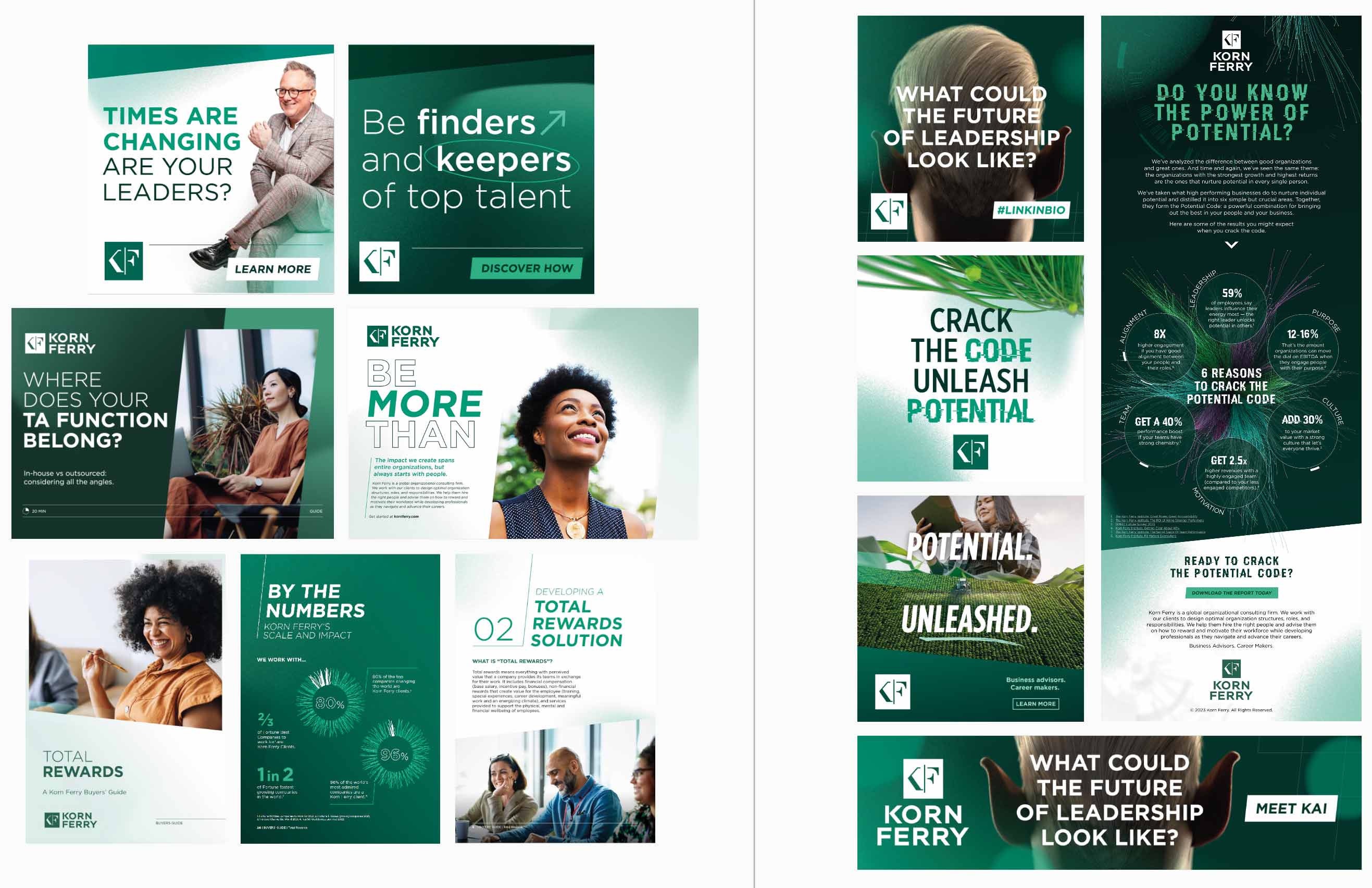
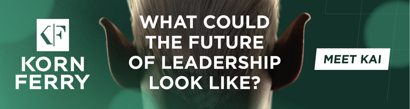
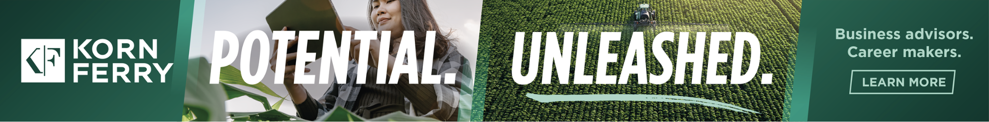
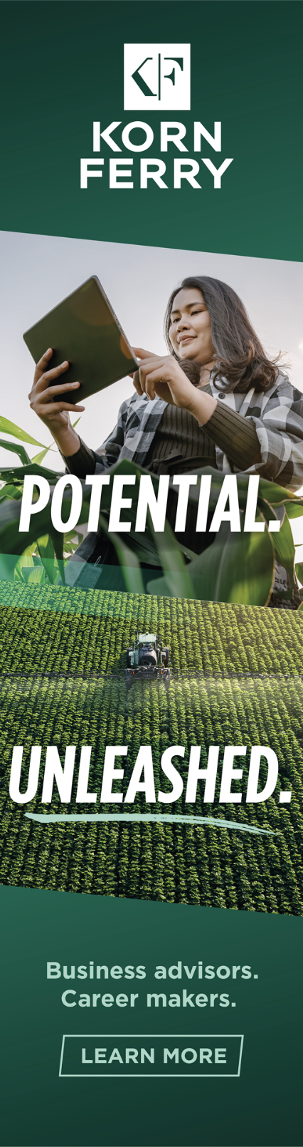
When designing content for advertising or paid media, always use the full logo to maximize brand visibility. The logo should be prominently positioned and appropriately scaled for awareness. For instance, in leaderboard banners, place the full logo in a large size, aligned to the left. In skyscraper banners, position the full logo at the top for optimal visibility.
Full logo aligned to the left.
Full logo at the top for optimal visibility.


